After receiving a paper sample pack from The Print Space I decided I wanted to test a range of them with one of my own prints. This would allow me to compare them like for like, as the sample pack uses a range of images that best suit that type of paper. Although this gives you a good example of the paper finish and quality, it doesn’t allow you to compare them like for like. Like choosing a specific film for photographing or a type of darkroom paper, different image will suit different digital paper; therefore to allow me to decide which is best for my final set of Headdress images, I needed to test them.
The Print Space offers both C-type and Giclee so I wanted to compare the two for colour, texture and tone. Research had taught me that C-type prints are considered real photographic prints as they are created with light sensitive paper that has silver crystals suspend in emulsion. This is then exposed to light, developed and fixed, much like the darkroom process, where as Giclee is a dry inject process where the ink is sprayed directly onto the paper. C-type also have a larger dynamic range than Giclee, so darker blacks and better highlight, however at The Print Space there is a greater selection of Giclee paper, therefore potentially making it easier to choose a paper which suites my images. Some Giclee paper is also considered better for a fine art work, as it can reproduce the effect of a painting. Given I am trying to create a painterly effect with these images this is something I’ve very interested in so will definitely be trying. Both paper types last for approximately 40 years however C-types can be cleaned with a damp cloth. However Giclee can be printed to much bigger format.
After looking through the different paper in the sample pack I decided on a range of five to try. I chose three C-type papers, Kodak Metallic, Fuji Flex and Fuji Matt and two Giclee papers, Harman Gloss Warmtone and Hahnemuhle German Etching. Although I know the overall feel I want for my images I was unsure about how to achieve this so I thought this selection gave me a good range of choices. I chose the Metallic and Flex based on the sheen they create, as this could be an alternative to the glow from a lightbox, which I am also considering. I would like the images to have a almost 3D dimension to them, so this metallic effect could help create that. Alternatively I would go with a painterly effect, which is why I chose the German Etching. I thought the Warmtone may add an interesting effect and I picked the Matt to see what the image looked like with quite a flat finish.
Today I received the prints back and the results are extremely interesting, however the first element that hit me was the differentiation of colour between them.

(Top-Bottom, Left – Right – Kodak Metallic, Fuji Matt, Fuji Flex, Harman Gloss Warmtone, Hahnemuhle German Etching)
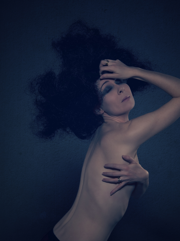
The Kodak Metallic is very cyan. The image is blue toned anyway and this has clearly been enhanced significantly with this paper. The finish, which I thought would be my preferred choice, does give a 3D dimension to the print but more in the style of a holographic, which creates quite a sci-fi feel to the image. The skin texture is lost and looks more like a synthetic hard material. The colour of the Fuji Matt is closer to the original however the matt surface is too one-dimensional. It’s almost as if your eye has hit a wall. As the paper name implies it is a very flat finish that doesn’t work with this image concept at all. However if you wanted a smooth non-reflective surface, this paper could be good. The Fuji Flex appears to have brought out the highlights in the image around the black headdress and on the skin, which is nice, however the surface is highly reflective which I believe could be an issue in an exhibition. The colour tone is cool as intended, which is also good, making it the best print out of the C-types.
The Harman Warmtone is considered a gloss finish however in comparison to the Metallic and Flex paper it seems quite subtle. The colour is definitely warmer, with a hit of magenta, but not to the point where it’s an issue. Overall the paper is ok, but I don’t believe it adds anything to the image, rather simple presents it as it. The German Etching on the other hand has blown me away. The colour is deep and rich on a dense matt finish. The texture of the paper has enhanced the painterly effect and creates a wonderful depth to the image which make you almost want to reach in and touch it. The shadows and highlights on the skin are enhanced to drawing your attention to the contours on the body. This paper for me is the clear winner. With this image it works perfectly, however my only concern is if it will be as effective on a lighter image. Whereas this image is dark and intense, others in the series are very light and bright and my concern is if the texture of the paper, which I feel gives depth to the image, will take away from this.
Going forward I think my only option is to try this paper with a lighter image. With this image it certainly create the feel and tone I am looking for with this series of images so I hope this will be the same with the others.


 The final image is the digital file taken at the same time as the 120 film under the same conditions.
 What this clearly demonstrates is the different in output quality depending on the processing method. Between the negative there is a clear difference in not only quality but colour. The drum scan is by far superior to the other two scans and results in a good quality clean and fine grained image. Although the digital film is sharper and better quality than the film, I feel it does not have the same aesthetical quality as the drum scan image. For me the colour and tone of that image is preferable. Therefore that is the option I would choose in the future.